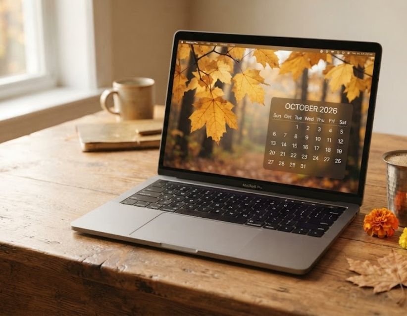

I got asked about the Pantone Color of the Year 2027 by three different people in one week, and every time I gave the same slightly awkward answer: it does not exist yet. Not officially, anyway.
I run a small corner of the internet where I write about the things that make daily life a little nicer, colors, small home fixes, outfits that don't need much thought. So when a topic like this comes up, I do not want to just repeat what I saw on Pinterest. I want to actually check, and then tell you what I found in plain language.
So here is where things stand, what the early signals are pointing toward, and what any of this could realistically mean if you live in India and just want your wardrobe or your living room to feel current.
Has Pantone Announced the Color of the Year 2027 Yet?
No. As of today, the Pantone Color of the Year 2027 has not been revealed. Pantone has a pattern it sticks to almost every year: the announcement lands in early December, roughly a month before the year it represents actually begins. So the reveal is expected sometime around early December 2026.
Until that moment, anything you read calling itself "the" 2027 color, on a blog, on Instagram, in a random forwarded message, is a guess. Some guesses are more informed than others, and I will walk you through the better ones below, but none of them are Pantone's word.
What Pantone Has Already Confirmed
Pantone's current, official pick is still PANTONE 11-4201 Cloud Dancer, chosen for 2026. It is a soft, warm white, the kind of shade that reads as calm rather than boring once you actually see it against wood tones or greenery.
Pantone has also already published its seasonal forecasting for 2027, the kind of report designers and manufacturers use to plan collections a year or two ahead. That is real, released material. It is just not the same thing as the annual Color of the Year announcement, and mixing the two up is where a lot of the online confusion is coming from.
What Is the Pantone Color of the Year, Anyway?
If you are newer to this whole tradition, here is the short version. Since 2000, the Pantone Color Institute has picked one shade every year meant to sum up the cultural mood, everything from what is happening in fashion and design to broader shifts in how people are feeling. The very first one was Cerulean Blue, chosen right as the new millennium started.
It has become a genuine industry event. Fashion houses, interior brands, cosmetics companies and graphic designers all use the pick as a jumping-off point. Some love it, some think it is more marketing than meaning, but either way it shapes what shows up in stores for the next twelve months. That is really the whole appeal: one color, filtered into a hundred different products.
What Do Pantone's 2027 Forecasts Actually Tell Us?
This is the part worth paying attention to, because it is not speculation, it is Pantone's own published material. Their seasonal reports for 2027 already exist and cover color direction across fashion, cosmetics, interiors, industrial design and digital media.
Reading through the general tone of that forecasting, a few themes keep surfacing:
- A pull toward richer, more saturated tones after a few fairly muted, neutral years
- Continued interest in earthy, nature-linked colors, greens, warm browns, clay tones
- A steady presence of blue-based shades, which tracks with what other forecasting agencies are also seeing
None of this confirms a single final shade. It just tells you the general mood color forecasters are picking up on right now, which is useful context while we wait.
Pantone Color of the Year 2027 Predictions: What People Are Guessing
Here is where I want to be careful with you, because a lot of pages out there present predictions as if they are confirmed facts. They are not. But a few of the guesses are backed by real signals, so I think they are worth mentioning.
Vibrant, luminous blue. This one is not actually a guess about Pantone, it is a separate, already-announced pick from WGSN x Coloro, a different color forecasting agency. They named Luminous Blue (Coloro 125-28-38) as their 2027 color back in April 2025. It is a strong signal for the broader color mood of 2027, but it is important to say clearly: this is WGSN x Coloro's choice, not Pantone's.
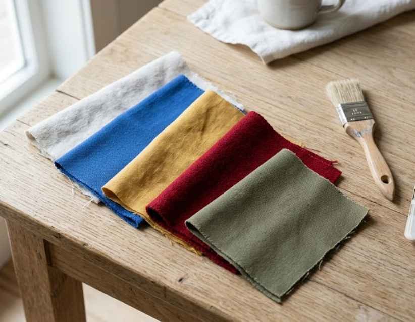
Warm yellow. Several independent prediction pages keep circling back to warmer yellows, partly as a counterpoint to how muted recent years have felt.
Rich red or burgundy. A deeper, more grounded red keeps coming up, especially in interior-focused predictions.
Earthy pink. Less candy-toned, more clay and terracotta-adjacent.
Olive and other natural greens. This one connects directly with the nature-based themes showing up in Pantone's own seasonal forecasting.
Again, none of these are official. Think of this list as a weather forecast, not a guarantee.
What Could the Pantone Color of the Year 2027 Mean for India?
This is honestly the part I care about most, because most of the coverage I have seen treats color trends like they land the same way everywhere. They do not. India already has such a rich, established color language, through festivals, weddings, textiles, that a global trend color rarely just gets copied here. It gets absorbed and reworked.
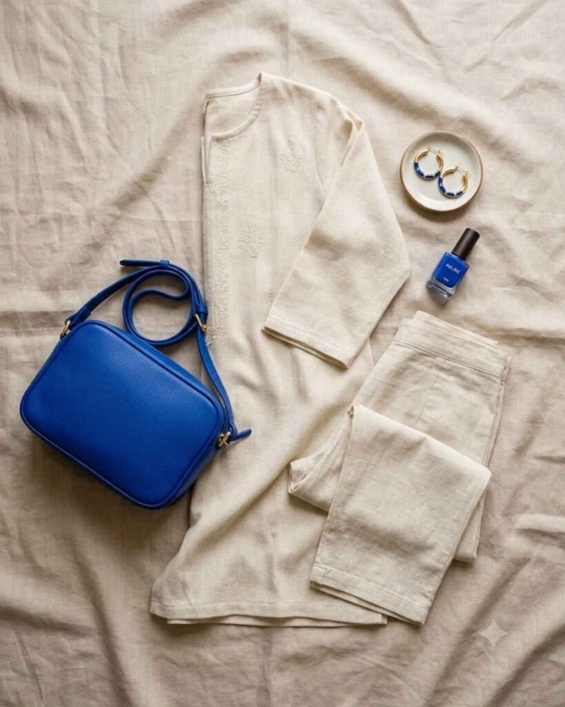
In fashion, whatever the eventual shade turns out to be, I would expect it to show up first in dupattas, co-ord sets and accessories rather than full outfits. That is usually the easiest, lowest-commitment way a new color enters someone's wardrobe.
In weddings, a strong statement color tends to appear in smaller touches before it takes over an entire event, think mehendi setup accents, invitation details or one bridesmaid outfit, rather than the whole décor scheme shifting overnight.
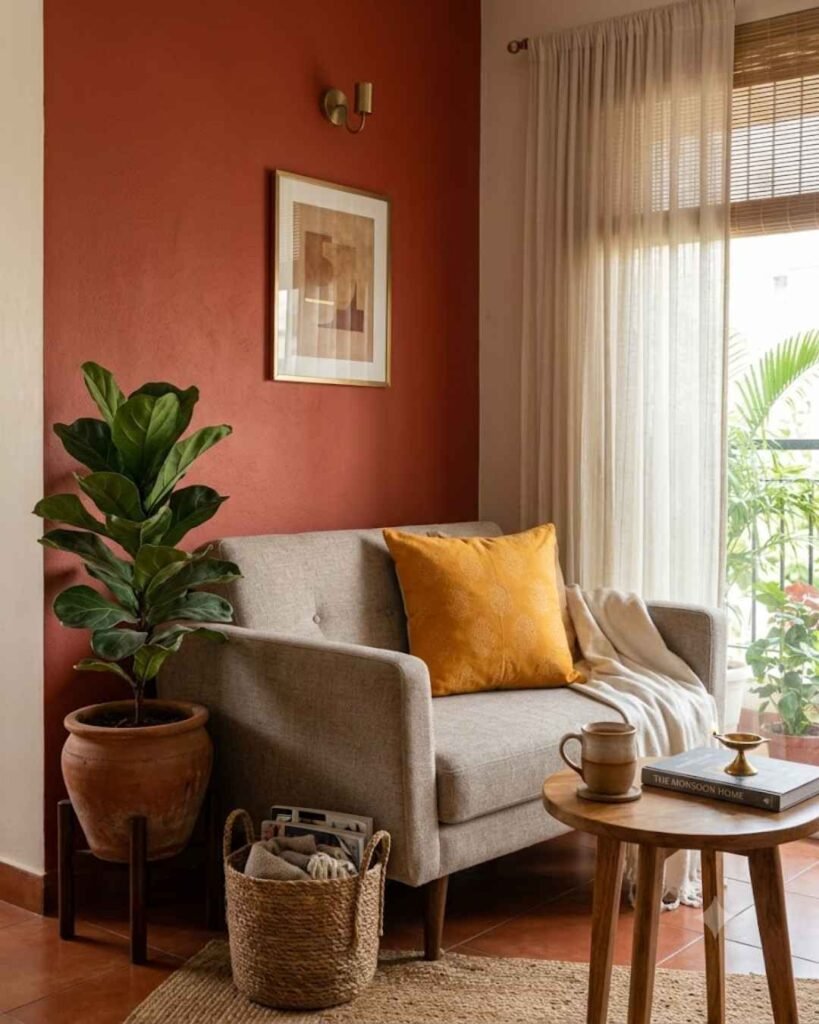
In home interiors, an accent wall, a set of cushions or curtains is a much easier way to bring in a bold new shade than repainting an entire room. If the eventual color leans toward something like a rich blue or a warm terracotta, both would sit comfortably in a lot of Indian homes already built around wood tones and warm lighting.
In beauty, expect it first in nail polish and packaging, since that is where brands tend to test a color's reception before going bigger.
In digital design, small business owners running Instagram pages or Etsy-style shops for their handmade goods can usually adapt fastest, since a color palette refresh on social graphics costs nothing but a little time.
Pantone 2027 in Fashion: Practical Ways to Wear It
You do not need to wait for the official reveal to start experimenting. If you want to lean into the general direction color forecasters are pointing toward:
- Add one statement piece in a bold shade rather than rebuilding your whole wardrobe
- Look at accessories first, bags, footwear, jewelry, since they are the cheapest way to test a color
- Pair a bold, saturated color with neutral basics you already own so it does not feel like a costume
Pantone 2027 at Home: Where to Start
If you are the kind of person who likes your space to feel current without a full renovation, small changes go a long way.
Painting kitchen cabinets is one of my favorite low-commitment ways to bring in a new color without touching an entire room, and it is something I have written about in more detail if you want the step-by-step version.
If you would rather start even smaller, a few DIY tutorials can help you test a color on a small piece before deciding whether you actually love it on a bigger scale, and building your own bookshelf is a nice project if you also want to bring in a new wood or color pairing at the same time.
How Brands Can Use the 2027 Color Early
If you run a small business, waiting for the official reveal is not always practical. A few low-risk ways to prepare:
- Build out seasonal Instagram templates using a couple of the predicted shades
- Update product photography backdrops with a neutral base that any eventual color will pair well with
- Keep your core branding stable and treat color trends as campaign-level decisions, not identity-level ones
Pantone 2026 vs the 2027 Direction
Cloud Dancer, the confirmed 2026 pick, is soft, quiet and neutral. Almost everything being floated for 2027, whether it is a saturated blue, a warm yellow or a deeper red, is louder by comparison. That kind of back-and-forth is actually pretty normal for Pantone. A calm year is often followed by something with more presence, partly because designers get restless working within a muted palette for too long.
When Will Pantone Announce the 2027 Color?
I am not going to invent a date here, because plenty of pages do exactly that and it does nobody any favors. What we know is the pattern: early December, about a month ahead of the year itself. I will update this section, and this entire page, the moment the real announcement lands.
A Few Honest Thoughts Before You Go
I will be straightforward about why I am even writing this before the answer exists. I would rather give you something accurate today, clearly labeled as a prediction where it is a prediction, than wait months and let you rely on guesswork from somewhere else in the meantime. I also try to keep small, sustainable routines in my own life while I write, things like sticking to a realistic sleep schedule and leaning on a handful of habits that actually stick, and I think there is a similar principle here: pay attention to the signals, but do not overhaul everything based on a color that has not even been confirmed yet.
I will come back and rewrite the middle of this article the day Pantone actually announces the 2027 pick. Bookmark it if you want the update without having to search again.
FAQs
Is the Pantone Color of the Year 2027 announced yet?
No, not as of now. Pantone's most recent official pick is Cloud Dancer, for 2026.
What color is predicted to be Pantone's 2027 Color of the Year?
There is no confirmed Pantone shade yet. Current guesses include warm yellow, rich red, earthy pink and natural greens, while WGSN x Coloro has already named Luminous Blue as their own separate 2027 pick.
What is WGSN's Color of the Year for 2027?
WGSN x Coloro selected Luminous Blue, Coloro code 125-28-38, announced in April 2025.
What was Pantone's 2026 Color of the Year?
PANTONE 11-4201 Cloud Dancer, a soft, warm white.
Where might the eventual 2027 color show up first?
Likely fashion accessories, home accents, nail polish and social media branding before it becomes a full wardrobe or room overhaul.
Quick tip 1: Do not treat Luminous Blue as Pantone's confirmed 2027 pick, it is a different forecasting agency's separate choice.
Quick tip 2: Once Pantone announces the real color, update the title, introduction, FAQs and color codes on this same page rather than publishing a new one.
Mindful Hive covers small, practical ideas across fashion, home and everyday living. Explore more on the homepage.